How to Read a Stock Chart: A Beginner’s Guide
How to Read a Stock Chart: A Beginner’s Guide to Technical Analysis will explain how to interpret stock charts, including understanding key components like price history, trading volume, and common patterns to help investors make informed decisions.
Want to understand the stock market but feel overwhelmed by the charts? This beginner’s guide to how to read a stock chart: a beginner’s guide to technical analysis will break down the complex world of stock charts into easy-to-understand concepts, helping you make informed investment decisions.
Understanding Stock Charts: The Basics
Stock charts are visual representations of a stock’s price movement over a specific period. They provide valuable insights into historical price trends, trading volume, and potential future price movements, making them essential tools for investors and traders.
What Information Do Stock Charts Display?
The basic elements of a stock chart include the x-axis (time) and the y-axis (price). Each data point represents the stock’s price at a specific moment in time. This data is often displayed in various formats, such as line charts, bar charts, and candlestick charts, each offering a unique perspective on price movements.
Different Types of Stock Charts
There are several types of stock charts, each with its own advantages. Line charts are simple and show the closing price over time. Bar charts display the open, high, low, and close prices for a specific period. Candlestick charts, however, are a more detailed version of bar charts and are widely used by traders.
- Line Charts: Simplest form, showing only closing prices connected by a line.
- Bar Charts: Indicate open, high, low, and close prices with vertical bars.
- Candlestick Charts: Similar to bar charts but with visually distinct “bodies” and “wicks.”
Understanding these basic types allows investors to choose the chart that best fits their analytical needs. Candlestick charts, for example, are known for their ability to quickly convey price direction and momentum.
In conclusion, stock charts are essential tools for investors. By understanding the basics, you can begin to decipher the story behind a stock’s price movements and make informed decisions. The ability to interpret these charts is a crucial skill for any investor looking to navigate the complexities of the stock market.
Key Components of a Stock Chart
To effectively read a stock chart, you need to understand its key components. These elements provide crucial information about the stock’s price behavior and trading activity, helping you make informed decisions.
Price History
Price history is how the stock price has changed over a certain amount of time. Looking at this history, investors can spot patterns such as trends, support, and resistance levels. Different types of charts can show this data, but they all offer the same basic info: where the price has been.
For example, a long-term uptrend suggests growing investor confidence, while a downtrend indicates potential concerns. Spotting these trends is very important to finding investment opportunities.
Trading Volume
Trading volume refers to the number of shares traded during a specific period. High trading volume can confirm the strength of a price trend, while low volume may indicate a lack of conviction. Here’s how volume can be interpreted:
- High Volume during Uptrend: Strengthens the bullish signal.
- High Volume during Downtrend: Reinforces the bearish sentiment.
- Low Volume: Suggests a weak trend that may not persist.
Support and Resistance Levels
Support and resistance levels are key price levels where the stock price tends to find support (a floor) or resistance (a ceiling). These levels are crucial for identifying potential entry and exit points.
Support levels are where buyers are likely to step in, preventing the price from falling further. Resistance levels are where sellers are likely to emerge, capping the price’s upward movement. Traders often use these levels to set stop-loss orders or take-profit targets.
To summarize, understanding price history, trading volume, and support & resistance levels is essential for reading stock charts. These components offer insights into past and potential future price action, empowering investors to make well-informed choices.
Understanding Candlestick Patterns
Candlestick patterns are visual representations of price movements that can provide valuable insights into market sentiment and potential future price action. Recognizing and understanding these patterns is a crucial skill for any technical analyst.
Basic Candlestick Anatomy
A candlestick represents the price movement for a single day or period. It consists of a body and wicks (or shadows). The body represents the range between the open and close prices, while the wicks indicate the high and low prices for that period.
If the closing price is higher than the opening price, the candlestick is typically green or white, indicating a bullish signal. Conversely, if the closing price is lower than the opening price, the candlestick is red or black, indicating a bearish signal.
Bullish Candlestick Patterns
Bullish candlestick patterns suggest that the price is likely to increase. Some common bullish patterns include:
- Hammer: A small body at the top of the candlestick with a long lower wick.
- Inverted Hammer: A small body at the bottom of the candlestick with a long upper wick.
- Bullish Engulfing: A large green candlestick that completely engulfs the previous red candlestick.
Bearish Candlestick Patterns
Bearish candlestick patterns, on the other hand, indicate that the price is likely to decrease. Examples of bearish patterns include:
- Hanging Man: Similar to the hammer, but occurs after an uptrend.
- Shooting Star: Similar to the inverted hammer, but occurs after an uptrend.
- Bearish Engulfing: A large red candlestick that completely engulfs the previous green candlestick.
To conclude, candlestick patterns are powerful tools for understanding market sentiment. By recognizing these patterns, traders can gain insights into potential price movements and make more informed trading decisions, significantly enhancing their ability to profit from market trends.
Using Technical Indicators
Technical indicators are mathematical calculations based on historical price and volume data. They are used to forecast future price movements and provide insights into market trends and potential trading opportunities.
Moving Averages (MA)
Moving averages smooth out price data by calculating the average price over a specified period. They help identify the direction of the trend and potential support and resistance levels.
There are various types of moving averages, including simple moving averages (SMA) and exponential moving averages (EMA). EMAs place more weight on recent prices, making them more responsive to new information.
Relative Strength Index (RSI)
The RSI is a momentum oscillator that measures the speed and change of price movements. It ranges from 0 to 100 and is used to identify overbought and oversold conditions.
An RSI above 70 typically indicates that the stock is overbought and may be due for a pullback, while an RSI below 30 suggests that the stock is oversold and may be poised for a rally.
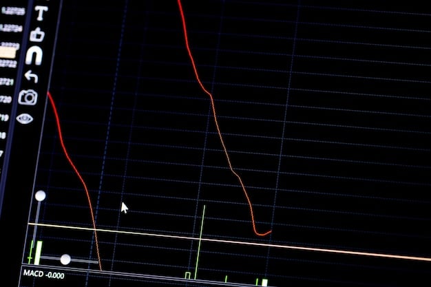
Moving Average Convergence Divergence (MACD)
MACD is a trend-following momentum indicator that shows the relationship between two moving averages of a stock’s price. The MACD consists of the MACD line, the signal line, and the histogram.
- MACD Line: Calculated by subtracting the 26-period EMA from the 12-period EMA.
- Signal Line: A 9-period EMA of the MACD line.
- Histogram: Represents the difference between the MACD line and the signal line.
Crossovers between the MACD line and the signal line are often used as trading signals. A bullish crossover occurs when the MACD line crosses above the signal line, while a bearish crossover occurs when the MACD line crosses below the signal line.

By examining these indicators, traders can better understand and predict the future direction of a stock’s price. They are valuable resources for any investor looking to add more precision to their strategy.
Identifying Trends on Stock Charts
Identifying trends is a fundamental aspect of technical analysis. Trends help you understand the direction in which a stock price is moving and make informed decisions about when to buy or sell.
Uptrends
An uptrend is characterized by a series of higher highs and higher lows. This indicates that buyers are more aggressive than sellers, driving the price upward.
To identify an uptrend, look for a chart pattern where each successive peak and trough is higher than the previous one. During an uptrend, it’s often wise to consider buying the stock.
Downtrends
A downtrend is the opposite of an uptrend, characterized by a series of lower highs and lower lows. This indicates that sellers are more aggressive than buyers, pushing the price downward.
Identifying a downtrend involves spotting a pattern where each successive peak and trough is lower than the previous one. During a downtrend, it might be wise to sell the stock or avoid buying.
Sideways Trends
A sideways trend, also known as a horizontal trend or consolidation, occurs when the price is moving within a relatively narrow range, without a clear upward or downward direction.
During a sideways trend, the price tends to oscillate between support and resistance levels. It’s important to be cautious during sideways trends, as breakouts can occur in either direction.
In summary, identifying trends is a crucial skill for traders and investors. By recognizing uptrends, downtrends, and sideways trends, one can get a better understanding of market dynamics, therefore improving their ability to make effective trading choices.
Practical Tips for Beginners
Reading stock charts may seem daunting at first, but with practice it can become a valuable skill. Here are some practical tips to help beginners get started with technical analysis.
Start with Simple Charts
Begin by focusing on simple chart types like line charts or basic candlestick charts. These charts provide a clear overview of price movements without overwhelming you with too much information.
- Line Charts: Track closing prices to see overall direction.
- Basic Candlestick Charts: Reveal opening, closing, high, and low prices.
Practice Regularly
The best way to improve your chart-reading skills is to practice regularly. Spend time analyzing different stock charts and identifying patterns, trends, and potential trading opportunities.
- Dedicate Time: Schedule specific times for chart analysis.
- Use Paper Trading: Practice trading without risking real money.
Use Multiple Timeframes
When analyzing stock charts, it’s important to consider multiple timeframes. Looking at daily, weekly, and monthly charts can provide a more comprehensive view of the stock’s price action.
Short-term charts are most useful for detecting short-term patterns and making quick trades, while long-term charts provide a broader view of market trends.
In conclusion, by starting with simple charts, practicing regularly, and using multiple timeframes, beginners can steadily develop their chart-reading skills and increase their confidence in the stock market.
| Key Point | Brief Description |
|---|---|
| 📈 Chart Types | Line, bar, and candlestick charts display price movements. |
| 📊 Volume | Indicates the number of shares traded. High volume strengthens trends. |
| 💡 Candlestick Patterns | Bullish and bearish patterns provide insights into market sentiment. |
| 🧭 Technical Indicators | Tools like Moving Averages and RSI help predict price movements. |
FAQ
▼
A stock chart is a visual representation of a stock’s price movement over a specific period, showing historical trends and trading volume.
▼
Candlestick patterns are visual representations of price movements that provide insights into market sentiment, using the body and wicks of a candle to represent price ranges.
▼
Trends are identified by analyzing successive highs and lows; uptrends show higher highs and lows, while downtrends show lower highs and lows over time.
▼
Trading volume is the number of shares traded during a specific period, indicating the strength of a price trend; high volume confirms the trend, while low volume suggests a weak one.
▼
Support levels are price levels where buying interest prevents further price decreases, while resistance levels prevent price increases due to selling pressure.
Conclusion
Understanding how to read a stock chart is an essential skill for any investor looking to make informed decisions in the stock market. By grasping the basics of chart types, key components, candlestick patterns, technical indicators, and trend identification, you can gain valuable insights into market dynamics and enhance your trading strategies. Keep practicing, stay informed, and approach the market with a well-rounded perspective.


